|
|
Statistical evidence of fraud
Ratios of mail-in ballots
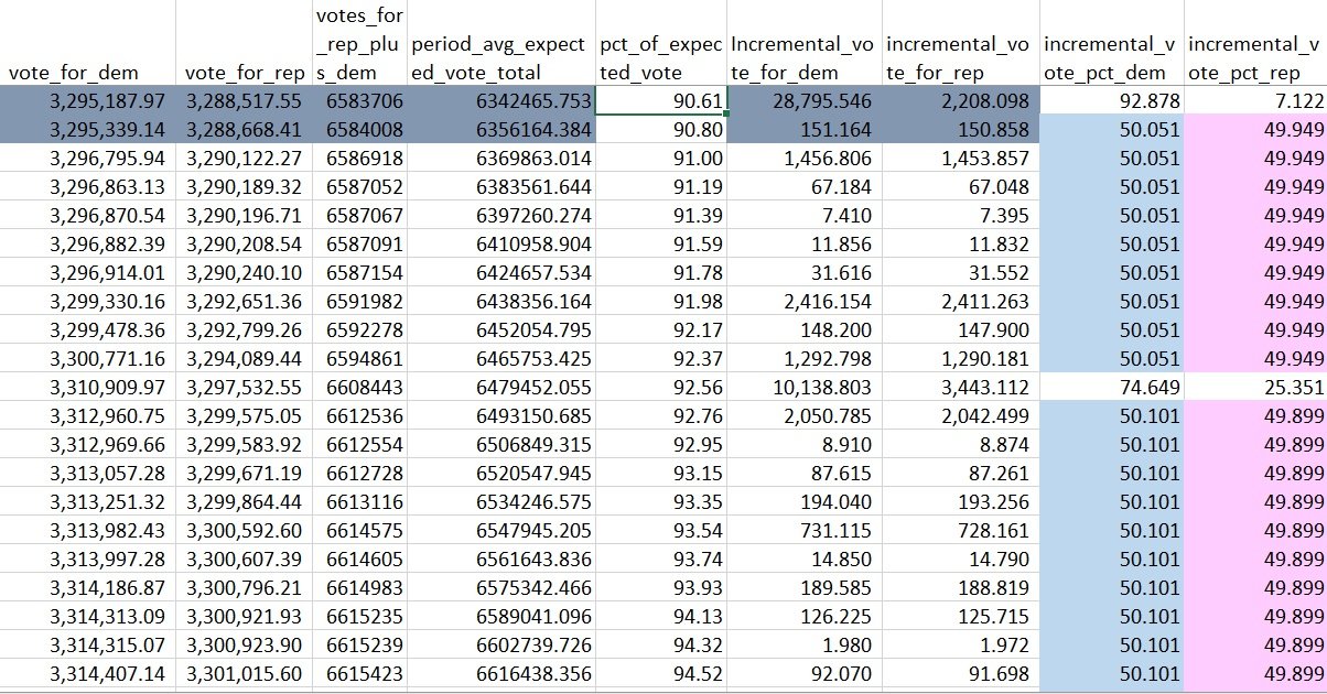
Batches of mail-in votes look statistically different from batches of in-person votes. An example from Florida shows a few things:- In-person batches are near the left of the graph, but scattered on the D/R axis.
- Mail-in batches get mixed in the mail, so follow a visible curve.
- Mail-in batches typically drift from higher D/R ratios to lower D/R ratios, because batches from big cities tend to arrive and be counted first.
In regions that are contested (and showed questionable behavior during counting on election night), the graphs are different. When Wisconsin counted the 169K lately-discovered absentee ballots, we see a jump off the mail-in curve:Here is a plot of the same Florida voting data, but this time it's the ratio of #Biden to #Trump ballots, versus time. What we see is that the initial ballot reportings are very noisy and "random".
— CulturalHusbandry (@APhilosophae) November 9, 2020
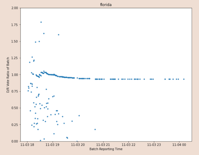
Not only is it a significant jump off the curve, but it beats the starting D/R ratio of the mail-in batches. Georgia shows another red flag. You can see the curve for mail-in batches drifting to lower D/R ratios, but it suddenly reverses course, and does so with multiple jumps:This is the Wisconsin vote counting history log. Again, on the Y axis we have the ratio of D to R ballots in reporting batch, and on the X axis we have reporting time.
— CulturalHusbandry (@APhilosophae) November 9, 2020
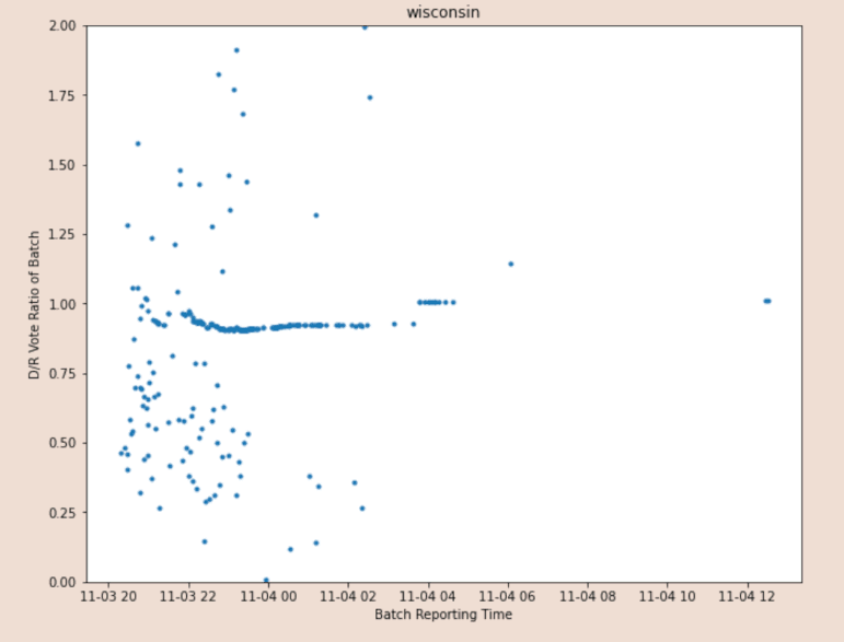
@APhilosophae shows anamolies in Pennsylvania, Michigan, and Virginia as well. It's worth reading the whole thread, which starts at https://twitter.com/APhilosophae/status/1325592112428163072. I've archived @APhilosophae's original data and original script.Lets look at another anomaly:
— CulturalHusbandry (@APhilosophae) November 9, 2020
Leading digit of totals (Benford's Law)
Benford's Law states that, in naturally ocurring numbers, the leading digit should be a "1" about 30% of the time, a "2" about 18% of the time, and on down to a "9" about 5% of the time. This pattern has been used to detect possible fraud in vote totals, which mostly follow the Law. Here are some graphs for Miami-Dade County, Florida, which follow the Law well enough to not raise suspicion: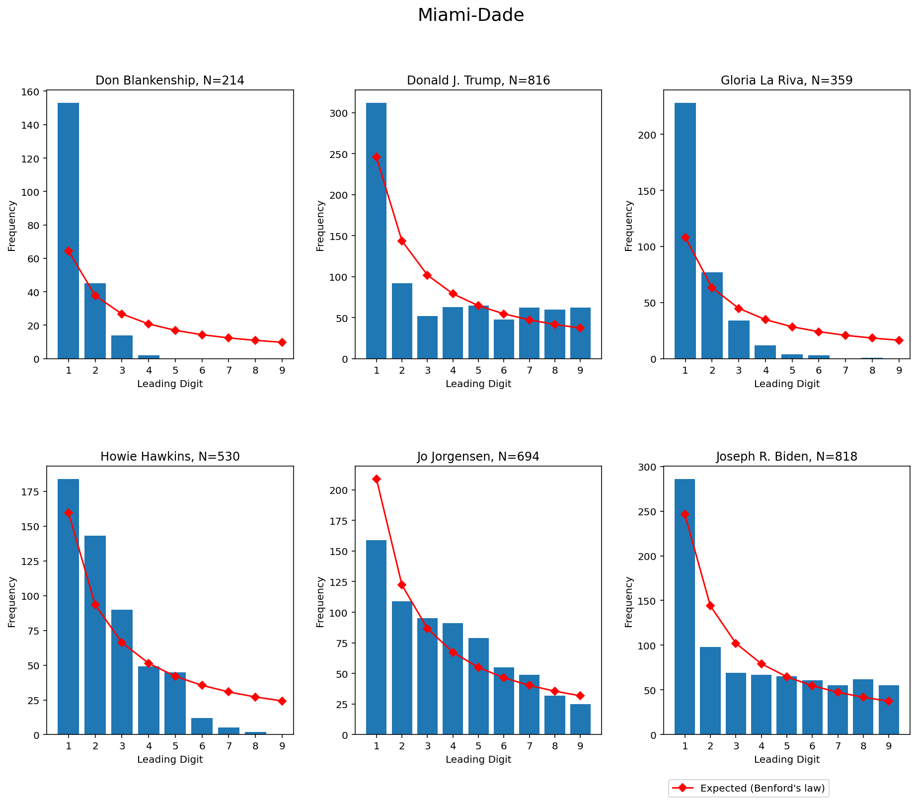
An analyst just ran the data with Allegheny using the Mebane 2nd digit test with Trump vs Biden. The difference was significant. It just doesn't work.
— Yo dat elefant (@YoDatElefant) November 7, 2020
Biden's is fishy, many significant deviations. In Trump's only 2 deviations but neither are significant at the 5% level.
Read the full thread at https://twitter.com/YoDatElefant/status/1324838425170595840.For Biden in Allegheny absentee ballots, there are multiple significant deviations. For Trump, none of the deviations are significant at the 5% level.
— Yo dat elefant (@YoDatElefant) November 7, 2020
Ratios of votes in mail-in batches are too uniform
At some point in counting mail-in votes, most batches in Virginia started to show the exact same ratio of votes: 55% for Biden versus 45% for Trump. The same pattern is also seen in Pennsylvania, where after some point, batches went 50.051% Biden versus 49.949% Trump. Later, the ratio changed to 50.101% Biden versus 49.899% Trump; again, for several batches in a row.